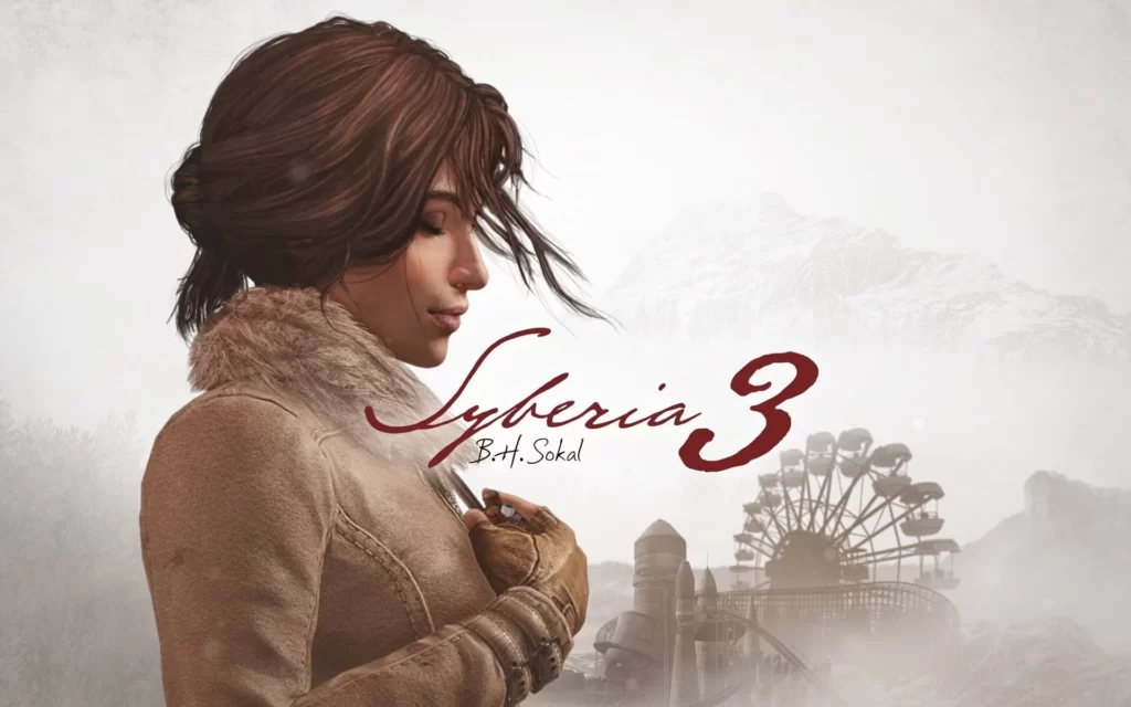
You’re “A traveler with no destination” – that’s the insightful piece of wisdom a character shares with series protagonist Kate Walker near the end of Syberia 3, and sadly it’s a sentiment that couldn’t be more accurate to this game; but also, the entire adventure game genre.
This is The Subtext and I’m Dan – join me on a journey full of ups and downs as we talk about the Nintendo Switch version of Syberia 3.
The Context of Syberia 3
I really enjoyed the original Syberia – it was a charming, offbeat adventure in a world full of clockwork Automatons and living mammoths that felt like it had been dreamt up in a child’s imagination.
Syberia II was a worthy successor and almost as good; only let down by slightly less memorable locations and some pacing issues – the Monastery and the Youkol Village were memorable for all the wrong reasons!
And now we have the latest game – it’s been thirteen years since Syberia II hit store shelves, so what’s changed?
Visually Appealing
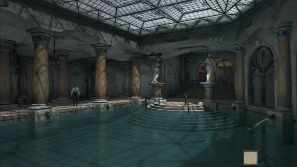
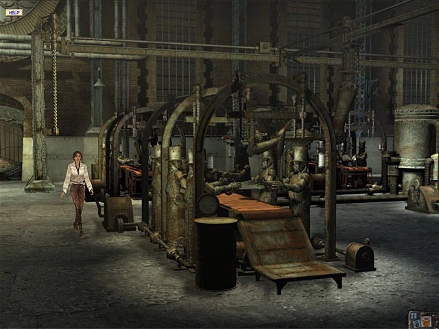
Well visually the game actually feels like a step back – Syberia I and II looked great in their time; but Syberia 3 is years behind today’s heavy hitters. In the Switch’s docked mode at least, things just don’t hold up.
Positives of Syberia 3
Let’s start off with the positives – resolution seems to be reasonably high, and the artwork has small flashes of potential. The transition to fully 3D environments also has a few benefits – scenes have more depth to them and now you can use the right analogue stick to control the camera. Well, a little bit – camera control is limited and sometimes Kate will disappear off the edge of the screen, with the camera unable to follow – which means you have no idea where you are or what you’re doing.
Negatives Are Plentiful
And the negatives? Well, I can reel off a long list for you;
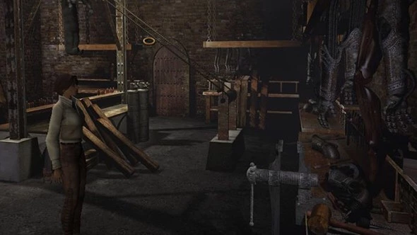
- Character models close up
- What the hair is that?!
- Playdough textures
- Animation
- Lip-syncing
- Water or gunge? Idk
- Bugs, bugs, bugs
- Stuttering
- Load times
Syberia 3 on Other Consoles
But how does the docked game stack up to other console versions? I checked out the PS4 version – although it’s far from ground-breaking, it does look significantly better. The biggest cutbacks to the Switch version seem to be the absence of depth of field and post-processing effects. The PS4 version also boasts better lighting, textures and shadows.
These enhancements bring Syberia 3 more in line visually with modern games and also help the game to look stylistically closer to its predecessors – so it’s a shame they’re missing on the Switch.
How it Plays on Handheld
In handheld mode the game looks better – the smaller screen and lower native resolution help to hide many of its flaws. Don’t expect miracles though – it doesn’t hold a candle to the best-looking Switch games.
Syberia 3 – The Soundtrack & Voicework
Syberia 3’s soundtrack, composed by Inon Zur, is actually quite beautiful. It reworks tracks from previous Syberia games into something that sounds new and fresh. Just listen to the title track!
On the other hand, voicework is not great – it’s too stilted and often sounds unnatural. Sharon Mann reprises her role as Kate Walker from the previous games, although here her voice sounds a little too old for the twenty-nine-year-old heroine.
Although Kate sounds a lot better than many of the other characters – almost all the characters we meet are supposed to be European, yet only some characters have European accents – the rest have this weird American accent that just sounds off.
And what the hell happened to Oscar’s voice?!
Syberia 3 – Gameplay
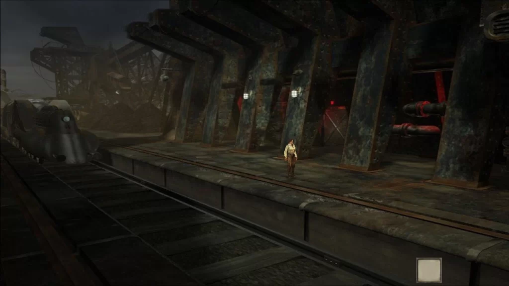
The problems don’t end there – also ripped wholesale from the previous games is the outdated gameplay.
You’ve got a never-ending laundry list of things to do – you tick one thing off and it’s straight onto the next.
Elements in the game world – characters and objects – are either essential to advance or a complete waste of time. It’s those little incidental details that flesh out a game world, providing background and context – and it’s these things that are completely lacking in Syberia 3.
You’re just aimlessly wandering, hoping to find the next piece of a puzzle you haven’t even found yet.
What Makes a Good Adventure Game?
According to famed adventure game auteur Ron Gilbert in an excellent article he wrote all the way back in 1989, which I’ll link below, the following are the most important features of good adventure game design:
- A relaxed pace: adventure games were developed as a counterpoint to action games, shifting the focus from quick reflexes to smart thinking.
- Removing fail states: which can cause frustration and also bring the experience to a grinding halt.
- Clear end and sub-objectives: he also made the point that sometimes keeping the player in the dark can be just as effective; provided it’s done properly.
- Puzzles to be implemented thoughtfully: and not be there to pad out the game. Also, puzzle solutions to be logical; not random – there’s nothing worse than stumbling on a solution by sheer dumb luck.
- Sense of progression: introducing new locations and characters at the right time to keep the player engaged and the game feeling fresh.
The Cages Metaphor
- The cages metaphor: this is probably the most interesting – there are two main schools of design when it comes to adventure games:
- The first has you locked in a metaphorical cage; usually a confined level of some sort – you can’t go back, and the way forward is barred for now – all tasks in the area must be completed to unlock the door to the next level. You follow a linear path from level to level, completing all objectives as you go, until you finish the game.
- The second has the same set of metaphorical cages, but this time you’re not locked inside – you’re outside in a hub area and you get to choose which level to enter first. If you get stuck in a particular level, you can leave, try a different level and come back later.
According to Gilbert, the second type is the better one – it gives the player more options if they get stuck, and thereby reduces potential frustration.
Syberia 3 Uses the First Type of Design
Unfortunately, Syberia 3 uses the first type of design, and also ignores many of Gilbert’s design principles.
Let’s return to our opening gambit – “A traveler with no destination”. It made some sense that Kate Walker – a busy New York lawyer, unhappy with her lot – would give up everything to help a little old man on a journey to fulfil his dying wish.
The problem in this third game is that motivations are paper thin – Kate’s main objective is to help the Youkol people finish their pilgrimage – but nothing feels fleshed out enough.
Syberia 3 – A Flawed Adventure Game
In the Tomb Raider reboot game, you get these little introspective moments with Lara sitting by the campfire, reflecting. Syberia 3 doesn’t have anything like that. Not once in the game does Kate stop to actually consider her situation – she offers to help out the Youkols despite not knowing what it’ll involve or even where they’re going – her motivation boils down to that it’s the right thing to do – and it just rings hollow.
An Empty Puppet
She used to be a strong protagonist, but here she’s reduced to little more than a puppet, doing everyone else’s busywork.
I’ll tell you what it feels like – it feels like the developers cobbled together a sequel after all these years to cash in on a once popular franchise, and ultimately, you’re left with one question – what’s the point?
The recent adventure game resurgence hasn’t been all bad though – we’ve seen a small number of very good games, like Ron Gilbert’s own Thimbleweed Park. In order to stay relevant though, more effort needs to go into modernising adventure games; or I fear we’ll see them disappear again.
Syberia 3 – My Final Thoughts (Spoilers)
To close the book on Syberia 3, there is a scene towards the end with something crucial missing!
Yep, no sound effects. Oh, and did I mention it’s taken from the big, dramatic, final cutscene? That’s right – there are zero sound effects for the entire final cutscene – I’m so done with this game right now.
Also, the game ended on a cliff-hanger and it looks like we’re getting a sequel, so there’s that to look forward to…
Well, that about wraps things up for this article. Don’t forget to leave a comment down below and let me know your thoughts. As always, this has been The Subtext and I have been Dan – until next time!
